The best coding fonts in 2026 are JetBrains Mono, Fira Code and Cascadia Code if you like ligatures, and Hack, Source Code Pro or IBM Plex Mono if you don't. If you want more code on screen, use Iosevka. All 16 fonts below are free, and each was downloaded from its official source on October 7, 2026 and measured from the font file itself.
Most lists of programming fonts are screenshots and opinions. This one reads the fonts. A script opened each file and recorded its licence, its weights, how wide its characters are and how tall its lowercase letters are. It also shaped 15 common code operators, such as ->, != and ===, with HarfBuzz, the text engine Chrome and VS Code use, to see which ones turn into ligatures. Then the same text was drawn in every font so you can compare them yourself.
Best coding fonts at a glance
All 16 are monospace fonts, the kind built for coding: every character is the same width, so code lines up in columns. "Columns" below is how many characters fit in 1000 pixels of editor width at 14 px. More columns means more code per line. "x-height" is how tall a lowercase x is as a share of the font size; a taller one reads larger at the same size.
Font | Ligatures | Columns | x-height | Weights | Italic | Licence |
|---|---|---|---|---|---|---|
JetBrains Mono | On by default | 119 | 0.55 | 100–800 | Yes | OFL |
Fira Code | On by default | 116 | 0.54 | 300–700 | No | OFL |
Cascadia Code | On by default | 122 | 0.52 | 200–700 | Yes | OFL |
Victor Mono | On by default | 119 | 0.62 | 100–700 | Yes | OFL |
Iosevka | On by default | 143 | 0.52 | 9 weights | Yes | OFL |
Monaspace Neon | Optional | 115 | 0.50 | 200–800 | Yes | OFL |
Commit Mono | Optional | 119 | 0.54 | Regular, bold | Yes | OFL |
Geist Mono | Optional | 119 | 0.53 | 100–900 | Yes | OFL |
Hack | None | 119 | 0.55 | Regular, bold | Yes | MIT and Bitstream Vera |
Source Code Pro | None | 119 | 0.48 | 200–900 | Yes | OFL |
IBM Plex Mono | None | 119 | 0.52 | Seven weights | Yes | OFL |
Roboto Mono | None | 119 | 0.53 | 100–700 | Yes | OFL |
Inconsolata | None | 143 | 0.46 | 200–900 | No | OFL |
Ubuntu Mono | None | 143 | 0.52 | Regular, bold | Yes | Ubuntu Font Licence |
Red Hat Mono | None | 119 | 0.49 | 300–700 | Yes | OFL |
Space Mono | None | 117 | 0.50 | Regular, bold | Yes | OFL |
OFL is the SIL Open Font License, which lets you use, bundle and share a font free of charge, including at work. "Optional" means the font has ligatures but keeps them switched off until you turn on one of its stylistic sets.
Which coding fonts have ligatures?
A ligature draws two or three characters as one symbol: != becomes ≠ and => becomes ⇒. It changes only what you see. The file still contains the original characters, so your code and your colleagues' editors are unaffected.
Shaping the 15 operators gave three groups:
On by default: JetBrains Mono, Fira Code and Cascadia Code changed all 15. Victor Mono and Iosevka changed 13. Iosevka's own README says not all of its ligatures "are enabled by default", which matches.
Present but off by default: Monaspace, Commit Mono and Geist Mono keep their ligatures in stylistic sets. Turned on, those sets join the characters subtly rather than replacing them with maths symbols.
None: Hack, Source Code Pro, IBM Plex Mono, Roboto Mono, Inconsolata, Ubuntu Mono, Red Hat Mono and Space Mono. Red Hat Mono and Source Code Pro only swap in a different hyphen or arrow shape.
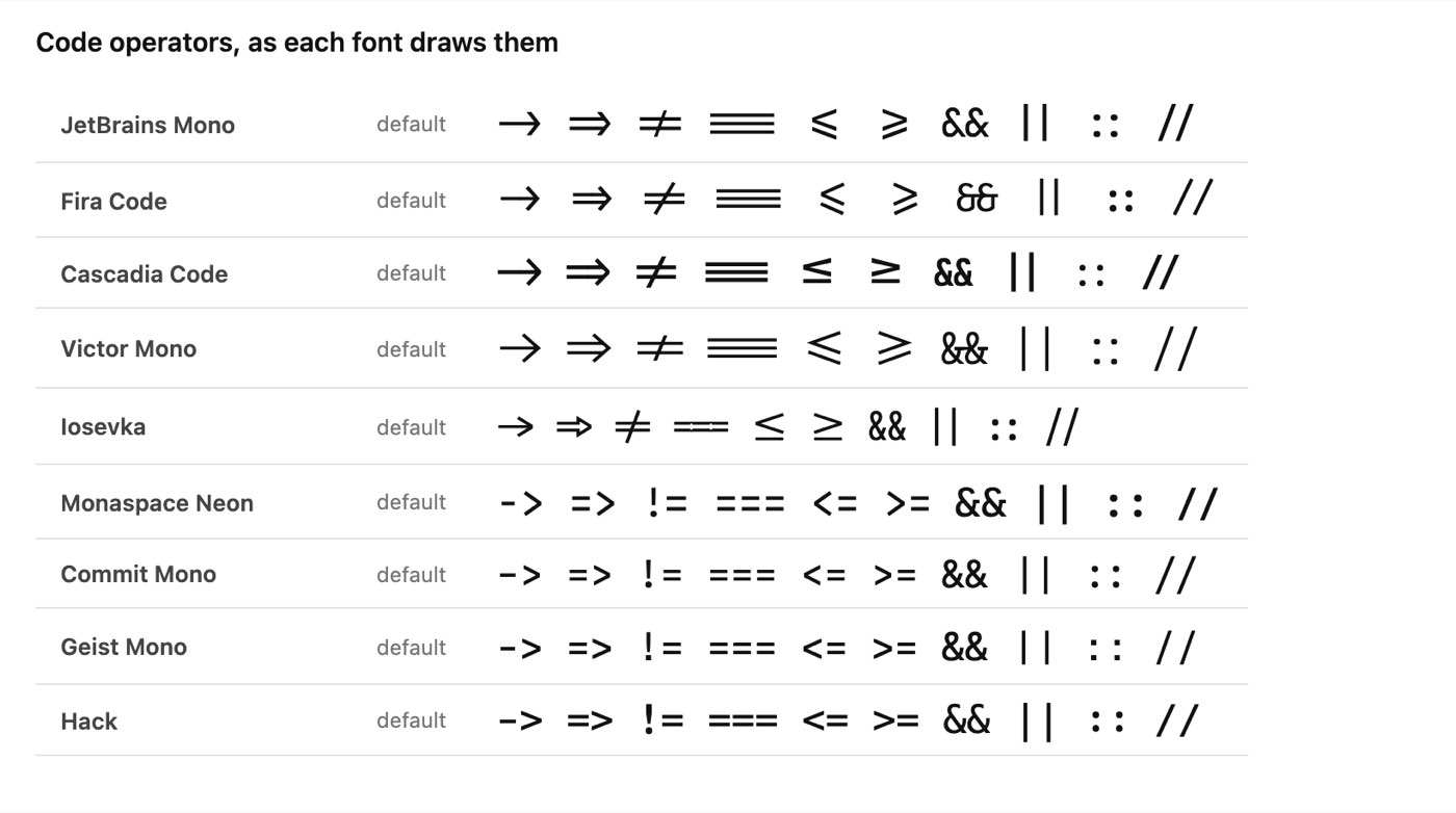
The same ten operators in nine fonts, rendered in Chromium from each font's official files on October 7, 2026, with every font at its default settings.
One catch: VS Code shows no ligatures at all until you switch them on, whatever the font. Its editor.fontLigatures setting is off by default, as the editor's source code shows. Set it to true to see them.
Can you tell 0 from O and l from 1?
This is the test that matters most for reading code, where O and 0 or l and 1 are different variables. All 16 fonts mark their zero, with a dot or a slash, so it never looks like a capital O. The file check agrees: in every font the zero is drawn with three outlines, one more than the letter O.
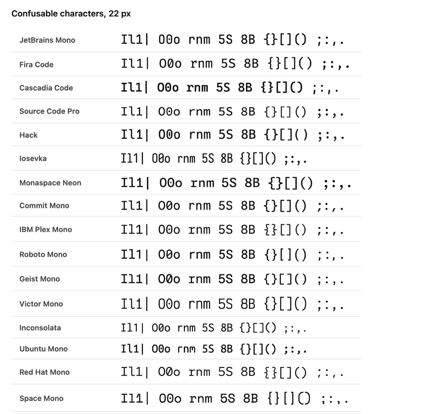
Easily confused characters at 22 px in all 16 fonts, rendered in Chromium from each font's official files on October 7, 2026.
Look at the first group in each row: capital I, lowercase l, the digit 1 and the pipe. In most fonts the lowercase l has a tail or a curve and the capital I has serifs, so the four never blur. Try the same check with the variable names you actually use; it is the quickest way to rule a font out.
Which coding font fits the most code on screen?
Most coding fonts are 0.6 of their size wide, which gave 119 columns per 1000 pixels at 14 px. Three are much narrower. Iosevka, Inconsolata and Ubuntu Mono are 0.5 wide, which fits 143 columns in the same space: 20% more code per line, useful in split panes and on laptop screens. At the other end, Monaspace Neon fits 115.
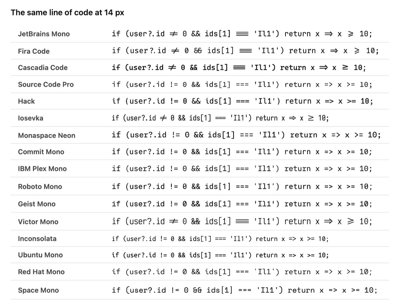
One line of code at 14 px in each font, rendered in Chromium on October 7, 2026. The three short lines are the narrow fonts.
Narrow is not automatically better. A narrower font at the same size has smaller letters, so many people raise the font size by a point, which gives back some of the space. Iosevka also comes in a wider "Extended" version for people who like its look but not its width.
The 16 coding fonts, one by one
JetBrains Mono
The safest single recommendation. Ligatures are on by default, the lowercase is tall (x-height 0.55) so it reads well small, and it has weights from 100 to 800 with italics. It is made by JetBrains, the company behind IntelliJ IDEA and PyCharm. Download from JetBrains.
Fira Code
The best-known ligature font. All 15 operators became ligatures in the test, the same as JetBrains Mono and Cascadia Code. Its one gap is italics: there are none. Fira Code on GitHub.
Cascadia Code
Microsoft's coding font, which its README says "comes bundled with Windows Terminal" and is the default in Visual Studio. It has 4,319 glyphs, more than any font here except Iosevka, and an italic. Cascadia Code on GitHub.
Victor Mono
The tallest lowercase in the test, with an x-height of 0.62, so it looks larger than the others at the same size. Ligatures are on by default, and it has italics in every weight from 100 to 700. Victor Mono's site.
Iosevka
The narrowest of the ligature fonts, at 143 columns, and the most configurable: nine weights, two widths, italic and oblique, and a build tool to make your own variant. The download is large, because one file holds 48,725 glyphs. Iosevka's site.
Monaspace Neon
Part of GitHub's Monaspace, "five variable axis typefaces" that are "metrics-compatible with one another", so you can mix them in one editor. Its README describes a technique it calls "texture healing". Its ligatures are optional; its README offers "Frozen" builds with every stylistic set already switched on, for editors that cannot set them. Monaspace's site.
Commit Mono
A neutral, quiet font in regular and bold, with optional ligatures in stylistic sets. Its character width and lowercase height sit right in the middle of the pack. Commit Mono's site.
Geist Mono
Vercel's coding font, added to Google Fonts in October 2024. Its ligatures sit in stylistic sets and are off by default; its zero is slashed. Geist on Vercel's site.
Hack
Built for source code and nothing else, with no ligatures and a heavy, clear shape that stays readable at small sizes. Its lowercase is as tall as JetBrains Mono's. Its last release, version 3.003, came out in 2018, and it still holds up. Hack's site.
Source Code Pro
Adobe's coding font: light, open and very even, in weights from 200 to 900. Its lowercase is on the short side (0.48), so try it a point larger than usual. Source Code Pro on GitHub.
IBM Plex Mono
IBM's corporate typeface, with more character than most: the lowercase r and the curly braces have distinctive shapes, as the image above shows. No ligatures. IBM Plex on GitHub.
Roboto Mono
The monospaced member of Google's Roboto family, so it sits well next to Android and Material interfaces. Plain and dependable, with no ligatures. Roboto Mono on Google Fonts.
Inconsolata
One of the oldest fonts here, on Google Fonts since 2010, and one of the narrowest at 143 columns. Its lowercase is the shortest in the test (0.46), and it has no italic. Inconsolata's page.
Ubuntu Mono
The Ubuntu desktop's coding font. Narrow like Iosevka and Inconsolata, with a rounder, friendlier shape, and published under the Ubuntu Font Licence rather than the OFL. The Ubuntu font family.
Red Hat Mono
Red Hat's coding font, with a slashed zero. It has the fewest glyphs here, 441, so check it covers the characters you need beyond English. Red Hat font on GitHub.
Space Mono
A display-style monospace with strong geometric shapes. Better for headings, slides and terminals with personality than for a full day of editing. Space Mono on Google Fonts.
Where do you find and install a coding font?
Download from the font's own site or GitHub release, linked under each font above, so you get the full version with every weight and its ligatures. Most of them are also on Google Fonts. Then install the files:
macOS: double-click the font file and click Install Font.
Windows: right-click the file and choose Install, or Install for all users.
Linux: copy the files to
~/.local/share/fontsand runfc-cache -f.
Restart your editor afterwards; most read the list of installed fonts only when they start.
How do you change the font in VS Code?
Install the font on your computer first, then open your settings file (Command Palette, "Preferences: Open User Settings (JSON)") and add:
{
  "editor.fontFamily": "'JetBrains Mono', Consolas, monospace",
  "editor.fontLigatures": true,
  "editor.fontSize": 14
}
The names after the first are fallbacks, used if the first font is missing. If you never set a font, VS Code uses its defaults, which its source code lists as:
System | Default editor font | Default size |
|---|---|---|
Windows | Consolas | 14 px |
macOS | Menlo | 12 px |
Linux | Droid Sans Mono | 14 px |
For fonts whose ligatures sit in stylistic sets, editor.fontLigatures also accepts a list of font features instead of true. For Monaspace, for example, "editor.fontLigatures": "'calt', 'ss01', 'ss02', 'ss03'" turns on the first three sets. The setting's description in VS Code says it takes "the value of the CSS 'font-feature-settings' property". The VS Code settings documentation explains where the settings file lives. The same settings work in Cursor, which is built on the VS Code codebase, as our Cursor vs Claude Code comparison explains.
Which coding font should you choose?
One font for everything: JetBrains Mono.
You love ligatures: Fira Code, or Cascadia Code if you also want italics and you work on Windows.
You dislike ligatures: Hack or IBM Plex Mono. Or keep JetBrains Mono and leave VS Code's ligature setting off.
Small screens and split panes: Iosevka, which fits 20% more per line, or Inconsolata.
You read code for hours: try the fonts with the tallest lowercase, Victor Mono and JetBrains Mono, and compare them at your usual size.
You want something newer: Monaspace or Geist Mono.
The best way to decide is a real file. Open something you know well, such as a long regular expression where every character counts, and switch between two or three candidates for a day each.
How these fonts were tested
On October 7, 2026, each font was downloaded from its official source: the project's own GitHub release for JetBrains Mono, Fira Code, Hack, Monaspace, Commit Mono and Iosevka, and Google's official fonts repository for the others. The regular weight of each was measured with fontTools and shaped with HarfBuzz, and the images were drawn in Chromium from the same files. No font was edited.
The widths and heights come from the font's own metrics. Columns assume a 14 px font size and 1000 pixels of editor width. The ligature test shaped 15 operators with each font's default features, then with its ligature features off, and counted those that changed. Which font looks best is still a matter of taste; the numbers are there to narrow the list, not to settle it.
Frequently asked questions
What is the best font for coding?
JetBrains Mono is the best all-round choice: free, ligatures on by default, a tall lowercase, a full range of weights and italics. Fira Code and Cascadia Code are close behind.
Is Fira Code or JetBrains Mono better?
Both changed all 15 test operators into ligatures. JetBrains Mono has italics and a slightly taller lowercase; Fira Code has no italics and a slightly wider character, fitting 116 columns to JetBrains Mono's 119.
Are these coding fonts free for commercial use?
Yes. Fourteen are under the SIL Open Font License, which allows use at work and bundling with software. Ubuntu Mono uses the Ubuntu Font Licence and Hack uses the MIT and Bitstream Vera licences, which also allow it.
Do ligatures change my code?
No. They change how characters are drawn on your screen, not what is saved. Anyone opening the file in another editor or font sees the original characters.
What font does VS Code use by default?
Consolas on Windows, Menlo on macOS and Droid Sans Mono on Linux, at 14 px on Windows and Linux and 12 px on macOS.
What is a Nerd Font?
A coding font with thousands of icons added for terminal prompts and file trees. The Nerd Fonts project "patches developer targeted fonts with a high number of glyphs (icons)", and most fonts in this list are available in patched versions.
What makes a good code font?
Three things: every character the same width, characters that can't be confused (0 and O, l and 1), and a lowercase tall enough to read at 12 to 14 px. Ligatures are a matter of taste.
Which coding font is best for small screens?
A narrow one: Iosevka, Inconsolata or Ubuntu Mono each fit 143 columns where most fonts fit 119.
Fonts are updated now and then, and the versions measured here were the latest on October 7, 2026. If a feature looks different in your copy, check the version number in your font manager.
The Writeouts editorial desk for developer tools: cheat sheets, references and tool comparisons you can keep open while you work, checked against official documentation. From the Writeouts editorial team.
See everything by @devtools-desk
0 comments
Sign in to join the discussion.
Loading comments…